
Packaging Design
Illustration | Typography | Package Design
Illustrator
– Project Overview –
Cece’s Veggie Noodle Co. is a company that specializes in creating spiraled vegetables as a healthier alternative to pasta. The goal of this redesign was to give the brand a look similar to pasta while still standing out because of its plant-based nature. Cece’s Veggie Co. prides itself on being organic and 100% real veggies, so it was important those ideas were included in the final look. This was a fictional redesign done for a packaging design class.
– Design Process –
Before
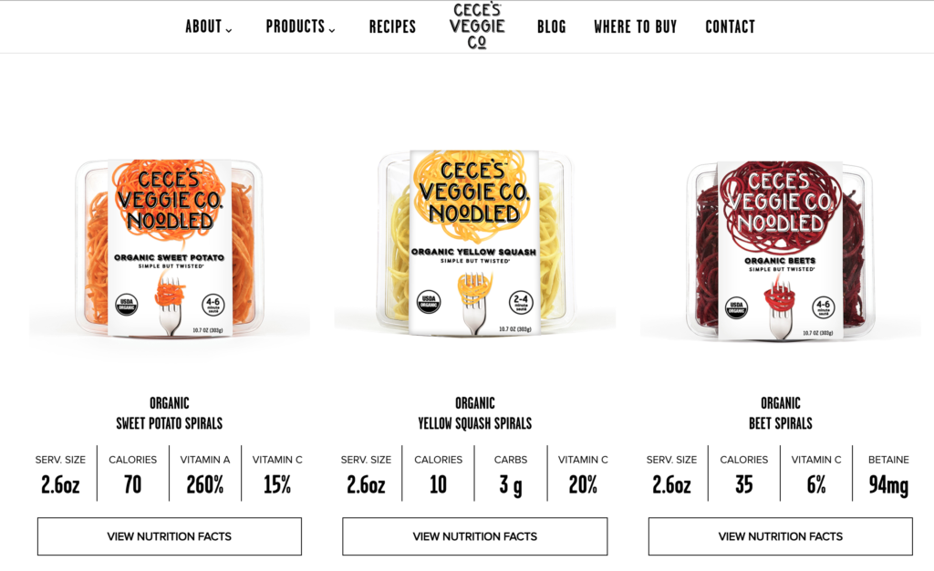
The original packaging for Cece’s is a plastic container which makes the product read more as produce than as a pasta alternative. There is also no picture on the package of what the vegetable looks like. The plastic packaging makes the noodles look like a premade dinner instead of a pasta alternative.
Creative Brief
To create a better packaging alternative for Cece’s Veggie Noodles a creative brief was written. The brief outlines the goals of the packaging redesign as well as the specific requirements that needed to be included, such as the brand logo. It also helps outline the brand’s messaging and who they want to target with the redesign.
Box Choice
To promote the idea of veggie noodles as an alternative to pasta, a cardboard box was chosen so that the box would look similar to a box of pasta. A box with a sliding compartment was chosen to make it easier to get to the product, because veggie noodles are not straight or small, so pouring them out like normal pasta would not work. The drawer box die cut was taken from a book called Packaging and Dielines, provided by the professor.
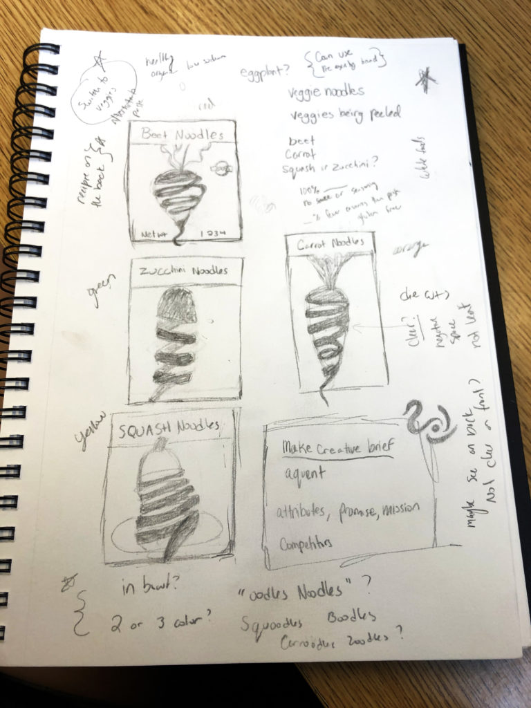
Sketch
The concept behind the illustration was to show the vegetable being spiraled into a noodle. This way the consumer better understands what the products is made from. The initial sketches included beets, carrots, squash, and zucchini. The leaves and stem of the vegetable would continue up into the name of the product to connect everything together.
In Progress
The design of the packaging went through a lot of changes before getting its final look. The idea of the spiraled veggie on the front was always the main focus, but then everything around it needed to get figured out. The initial idea was to show the vegetable in the ground, but after feedback from peers it was determined this design wasn’t going to work. The packaging needed to look organic but modern, so some ideas were thrown around about maybe using a pattern. A pattern was developed around the beet illustration and it worked really well. It was then incorporated onto the entire box as the background pattern.